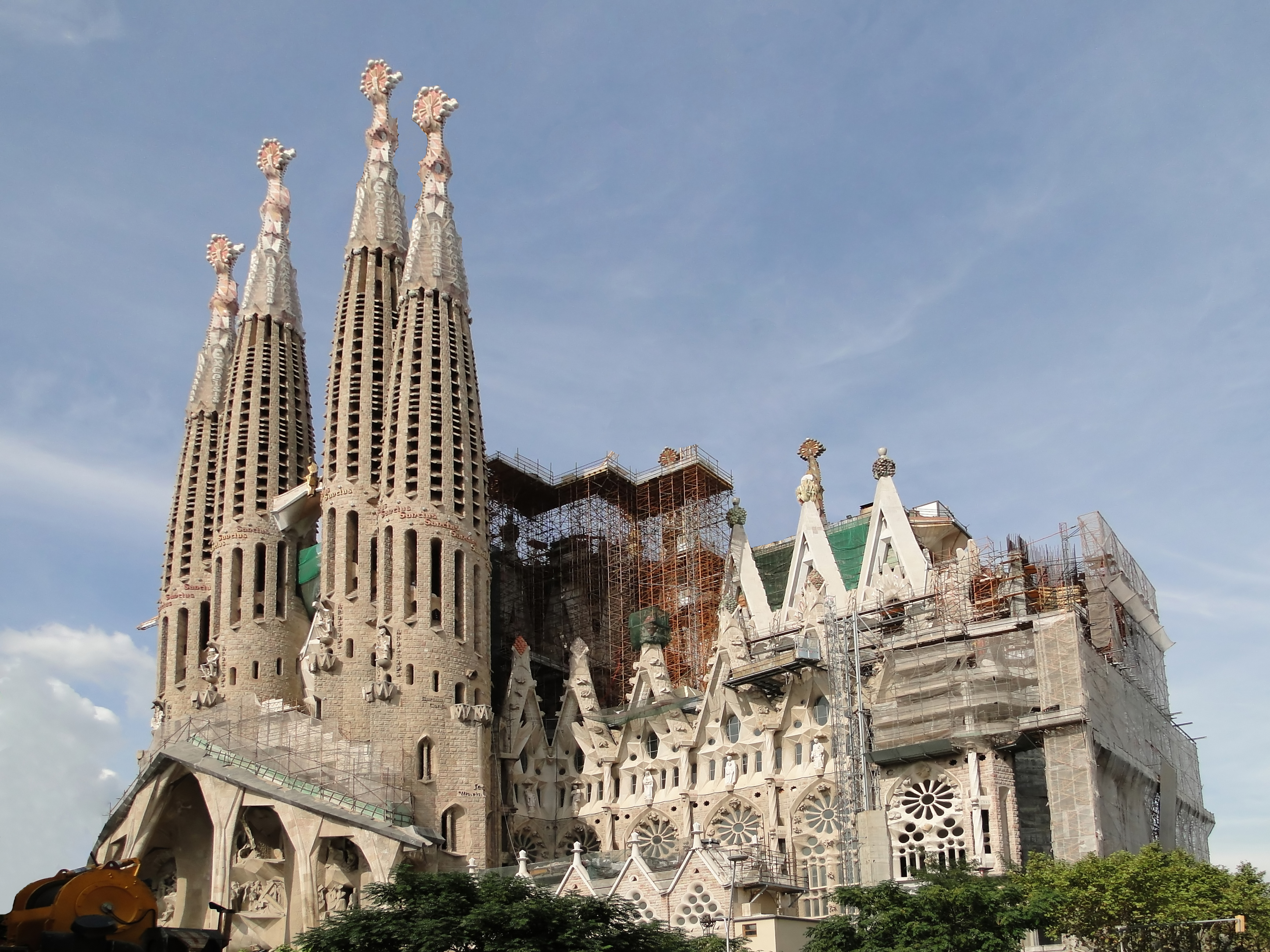
"I went to have a look at the cathedral—a modern cathedral, and one of the most hideous buildings in the world. It has four crenellated spires exactly the shape of hock bottles ... I think the Anarchists showed bad taste in not blowing it up ... though they did hang a red and black banner between its spires" - George Orwell on Sagrada Familia in Barcelona, found in Homage to Catalonia

It has its appeal.
ReplyDeleteI find the older parts to be rather interesting (e.g. the Nativity façade), and the interior is quite impressive. It's an acquired taste, but it does follow a traditional church layout, which can't be said of many other modern churches.
ReplyDeleteWhile its not near as hideous as some of the structures featured on this blog, there's something just... off about it (especially the bottle spires and the inside).
ReplyDeleteMaybe it's that the thing resembles too closely some goofy space city or villainous Fortress of DOOOOOOM. The rocket-like towers don't help.
I find the trends in architecture back then, and the reaction from a socialist agnostic/atheist on a purely aesthetic level, quite fascinating.
It has the appeal because it reminds of gothic.
ReplyDeleteI would classify that as natural(istic) gothic.
La Sagrada Familia is not to my taste, but I do have something of a liking for the Nativity facade - in contrast to more recent abstract carvings, like the Passion facade, which are depressingly datable to the mid-late 20th century, surely the artistic nadir of Western Civilization.
ReplyDelete